JAY BURTON TRACY | Paintings
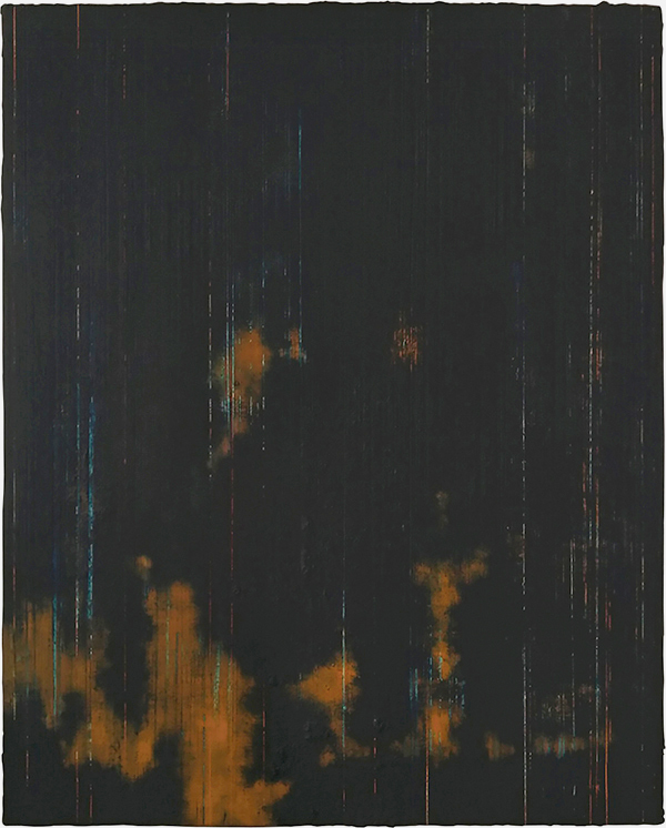
emergency painting #3, 2020–2021
oil- and water-soluble color, bone ash, mica, sand, oil- and water-based
polyurethane, homemade walnut ink, studio dust on aluminum panel
20 x 16 inches | collection of the artist
polyurethane, homemade walnut ink, studio dust on aluminum panel
20 x 16 inches | collection of the artist
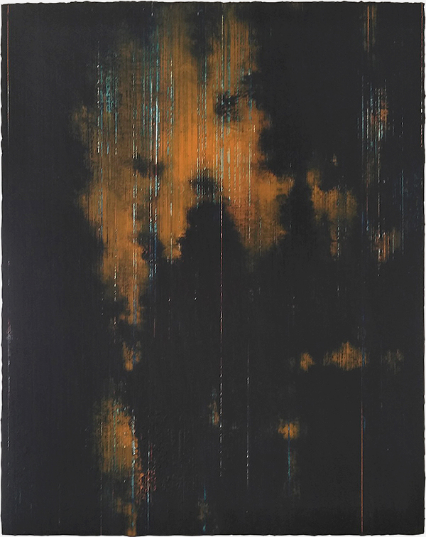
emergency painting #4, 2020–2021
oil- and water-soluble color, bone ash, mica, sand, oil- and water-based
polyurethane, homemade walnut ink, studio dust on aluminum panel
20 x 16 inches | collection of the artist
polyurethane, homemade walnut ink, studio dust on aluminum panel
20 x 16 inches | collection of the artist
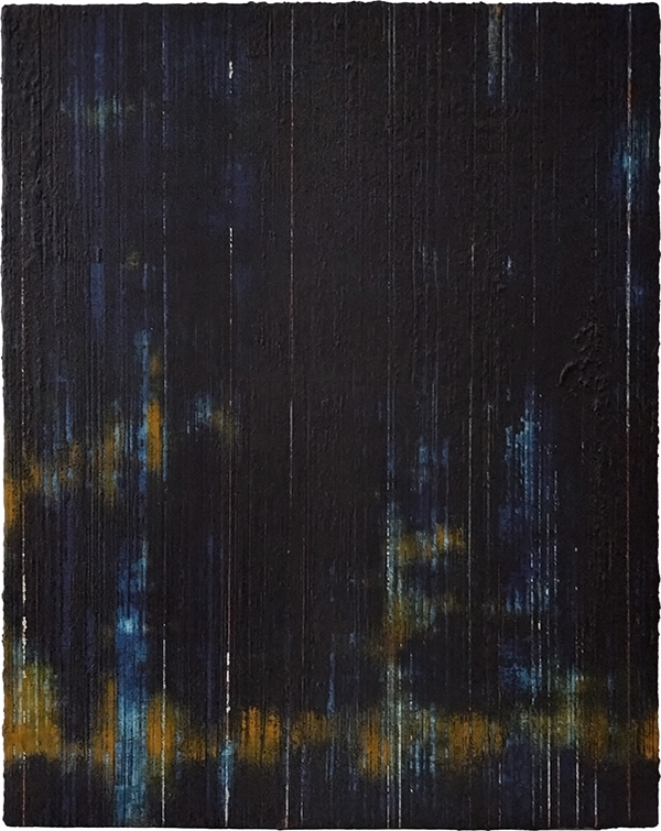
emergency painting #5, 2020–2021
oil- and water-soluble color, bone ash, mica, sand, oil- and water-based
polyurethane, homemade walnut ink, studio dust on aluminum panel
20 x 16 inches | collection of the artist
polyurethane, homemade walnut ink, studio dust on aluminum panel
20 x 16 inches | collection of the artist
these mixed media paintings
are from a series initiated at the height
of the coronavirus pandemic.
some of the formal decisions made—
the color palette* in particular—
are intended to visually and
viscerally connect the severity
and reach of the pandemic with
the general sense of alarm that,
at the time, grew in fits and starts
only to later stall altogether
in the divisive mire of politics
and the tragedy of a million
needless US deaths.
running concurrently with the
COVID health crisis were a seemingly
large number of natural and climate-related
disasters—wildfires, floods, hurricanes,
and earthquakes—all of which added
to the chaotic turbulence of daily life.
as before, slow accretive processes trace
and memorialize various aspects of what
i now term the ruptured quotidian.
this time, however, the color orange
stands as sign, symbol, and signifier—
free to speak topically from inside
a narrative frame; in ways i might
not otherwise normally allow.
the emergency series of paintings,
like the extensive (details from)
The Ruined Sky series, is an ongoing,
open-ended investigation.
__________
*the orange alert, established by
and associated with the us department
of homeland security 's advisory system
(established after 9/11,)
was a direct inspiration for
the color palette used here.
home studio (northwood, iowa)